
Showing posts with label identity. Show all posts
Showing posts with label identity. Show all posts
Sunday, November 13, 2011

Tuesday, October 18, 2011


Berepper Brewage
My friend Matt and his family have been brewing their own beer for a while now, and recently asked for my help with an identity and label design.
Here are the latest three:

and here are the earlier rounds:


Here are the latest three:

and here are the earlier rounds:


Sunday, October 16, 2011
Houston Texans
Once the Oilers, now the Texans (a revival of the original Dallas Texans).
Below is the current logo:

The typeface is fine, but it echoes the oversimplification of the bull mark. I understand the nod to the Texas flag but it's still too plain and executed poorly.
If you want to use an animal why not use the whole body like the Lions, or the Bills?

I propose a stylized bull charging (full body) in gold with a blue stroke on a white helmet. Even my wife agrees, "there are too many blue and red teams"
The gold is to separate the team from the pack a little - keeping away from the strict blue and red teams we see so often (Bills, Patriots, Giants, Titans)


Below is the current logo:

The typeface is fine, but it echoes the oversimplification of the bull mark. I understand the nod to the Texas flag but it's still too plain and executed poorly.
If you want to use an animal why not use the whole body like the Lions, or the Bills?

I propose a stylized bull charging (full body) in gold with a blue stroke on a white helmet. Even my wife agrees, "there are too many blue and red teams"
The gold is to separate the team from the pack a little - keeping away from the strict blue and red teams we see so often (Bills, Patriots, Giants, Titans)


Saturday, October 15, 2011
San Francisco 49ers
San Francisco 49ers - amazing team with a rich history - forget about the Super Bowl blowout against the Chargers :(
In 1996 the 49ers changed their helmet decal to what you see here:

They added a tapered gold ellipse around the red oval and a solid drop shadow the the "SF." One thing that always bothered me about the logo is that the "S" is above the "F" and not interlocked. Why wouldn't it be? Is there anything gained by the gold stroke around the red oval? Seems superfluous. I can't help but reiterate that the old logos are what sells. Everyone is buying old merch, not new.

My logo proposes the interlocking of the "S" and the "F" and the removal of that gold stroke. As well as a return to the bright red instead of the maroon that the team has adopted lately.
Here is a look at the current logotype:

Below is my attempt at something new:

The old time, wild west type had to go, no question. So the logical solution would be a serif type - which they used in the updated logo, but I am proposing a cleaner look. Here I've used Baskerville Italic. The type is relevant to the period (1849) but not so dated that the type doesn't apply to contemporary design sensibilities. I also put more emphasis on the time period by making the type "gold" instead of red.
Black and white application:

I've also created a secondary icon of the 49er himself:

Here is a look at the helmet and uniform:


In 1996 the 49ers changed their helmet decal to what you see here:

They added a tapered gold ellipse around the red oval and a solid drop shadow the the "SF." One thing that always bothered me about the logo is that the "S" is above the "F" and not interlocked. Why wouldn't it be? Is there anything gained by the gold stroke around the red oval? Seems superfluous. I can't help but reiterate that the old logos are what sells. Everyone is buying old merch, not new.

My logo proposes the interlocking of the "S" and the "F" and the removal of that gold stroke. As well as a return to the bright red instead of the maroon that the team has adopted lately.
Here is a look at the current logotype:

Below is my attempt at something new:

The old time, wild west type had to go, no question. So the logical solution would be a serif type - which they used in the updated logo, but I am proposing a cleaner look. Here I've used Baskerville Italic. The type is relevant to the period (1849) but not so dated that the type doesn't apply to contemporary design sensibilities. I also put more emphasis on the time period by making the type "gold" instead of red.
Black and white application:

I've also created a secondary icon of the 49er himself:

Here is a look at the helmet and uniform:


Tennessee Titans
I'm not saying the current Titans identity is terrible, I just think it could be better. The flames and the "T" sword are great attempts, but too juvenile for the NFL. For being a team that was acquired from the Houston Oilers, one of the best logos of the 90s and still has a presence in the NFL merchandising market, it feels appropriate that a similar iconography should follow through to the new team.

The current identity is like most expansion teams, too modern. I understand the attempt to hang onto the Oilers blue but the rest is hopelessly arbitrary. Tennessee (Nashville in particular) is a state know for it's contributions to the word of music. "Country stars" or "6-string slingers" are out of the question as far as team names, but are Titans a true representation of the state?

The Tennessee state flag (which the current logo has appropriated the three stars from) is very graphic and memorable. Why complicate it with odes to Greek mythology a la "Jason and the Argonauts?"

Here is my version of the icon for the Titans - a direct pickup of the 3 stars from the flag with some embellishments to modernize the icon.

Kept the white helmet and blue face mask - but changed the stripes on the helmet from blue to red. I wanted to keep the icon from the flag, but not go completely literal but having a red helmet with the blue circle and 3 stars.
Below are the logotype and uniform:


The current identity is like most expansion teams, too modern. I understand the attempt to hang onto the Oilers blue but the rest is hopelessly arbitrary. Tennessee (Nashville in particular) is a state know for it's contributions to the word of music. "Country stars" or "6-string slingers" are out of the question as far as team names, but are Titans a true representation of the state?

The Tennessee state flag (which the current logo has appropriated the three stars from) is very graphic and memorable. Why complicate it with odes to Greek mythology a la "Jason and the Argonauts?"

Here is my version of the icon for the Titans - a direct pickup of the 3 stars from the flag with some embellishments to modernize the icon.

Kept the white helmet and blue face mask - but changed the stripes on the helmet from blue to red. I wanted to keep the icon from the flag, but not go completely literal but having a red helmet with the blue circle and 3 stars.
Below are the logotype and uniform:


Sunday, September 25, 2011


Sunday, August 14, 2011
Freewave Productions Branding
This is a brand I worked on a few months ago and have been meaning to post. Below is the creative process from sketches presented to the client, refined sketches and the final product:


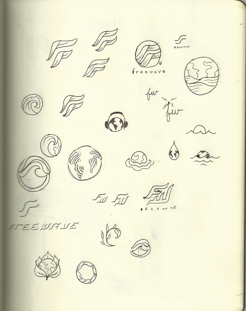
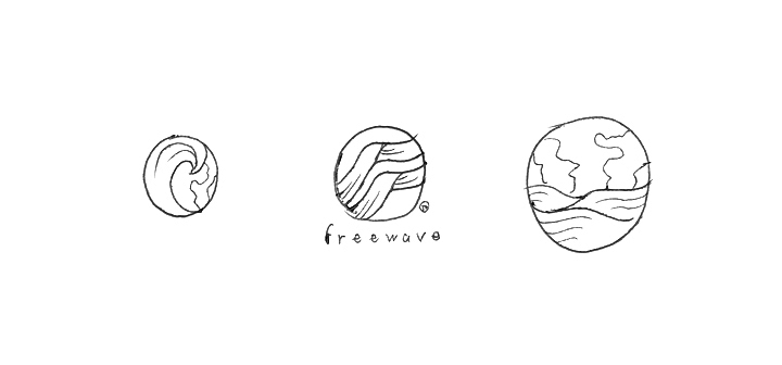

Friday, July 1, 2011
Jagstang Logo
Had this idea stuck in my head all week and have been sketching it at work. Figured it was time to do something about it:


Saturday, June 18, 2011
Tampa Bay Devil Rays
On the baseball kick again; this time around the Tampa Bay Devil Rays.
I can't help but notice that the team has totally lost whatever identity they were going for in the first place. Originally they went the typical expansion team route with a garish color scheme and futuristic san serif logotype.

It really isn't a bad logo it just doesn't look like a baseball logo (especially that type).
After kicking the gradient purple/green identity around for a few years they came up with their latest effort - the recurring navy and white look:

So I thought, why not have a color scheme that reflects the teams name (and has the ray incorporated back into the logo). By this I mean black, like the color of an actual devil ray. Sure you can say, "the tigers aren't yellow, the cardinals don't always wear red, and the blue jays wear black," but I can't help but feel that too many teams are leaning towards blue identities.
My idea is to keep the main color black with accents of red. A color scheme that doesn't really exist in the American League:

Below is my interpretation of what I would like to see: Retro script, solid colors, and little embellishment.


I can't help but notice that the team has totally lost whatever identity they were going for in the first place. Originally they went the typical expansion team route with a garish color scheme and futuristic san serif logotype.

It really isn't a bad logo it just doesn't look like a baseball logo (especially that type).
After kicking the gradient purple/green identity around for a few years they came up with their latest effort - the recurring navy and white look:

So I thought, why not have a color scheme that reflects the teams name (and has the ray incorporated back into the logo). By this I mean black, like the color of an actual devil ray. Sure you can say, "the tigers aren't yellow, the cardinals don't always wear red, and the blue jays wear black," but I can't help but feel that too many teams are leaning towards blue identities.
My idea is to keep the main color black with accents of red. A color scheme that doesn't really exist in the American League:

Below is my interpretation of what I would like to see: Retro script, solid colors, and little embellishment.


Monday, April 18, 2011
San Diego Padres Rebrand
How could I not do my home team? Especially after stopping by 5 and a Dime to check out their "Bring Back the Brown" merch. Check out more on my Behance page.


Subscribe to:
Posts (Atom)

