Showing posts with label rebranding. Show all posts

Sunday, September 25, 2011

Baltimore Ravens - part 3


New approach to the purple bird, but with more gold.

Saturday, September 24, 2011

Baltimore Ravens - part 2

New approach to the ravens rebrand with the Orioles black & orange:


Sunday, September 18, 2011

Baltimore Ravens

"Football is back" - in that spirit I will be rebranding as many football teams as I can during the season.

Out of the few cities I've visited in America, Baltimore is one that I will never forget. One summer my best friend and I visited and took in all the sites, both historical and modern. Although we never got the chance to see an Orioles or Ravens game.

Certain cities have a binding theme with all their sports teams (which I will delve further into in another post) and Baltimore is no exception. Currently all their professional teams are birds. I've always loved the stylized Oriole. Why not use the same application for the Ravens? Why use that dated generation x look (broncos, eagles, patriots), and be relegated to that uniformity? The current Ravens head is fine, but again has no impact. It gets lost with all those other logos that even have the same basic shape in the composition.

Below are my attempts to bring that Oriole look to the Ravens:

Friday, July 1, 2011

Jagstang Logo

Had this idea stuck in my head all week and have been sketching it at work. Figured it was time to do something about it:


Saturday, June 18, 2011

Tampa Bay Devil Rays

On the baseball kick again; this time around the Tampa Bay Devil Rays.

I can't help but notice that the team has totally lost whatever identity they were going for in the first place. Originally they went the typical expansion team route with a garish color scheme and futuristic san serif logotype.


It really isn't a bad logo it just doesn't look like a baseball logo (especially that type).
After kicking the gradient purple/green identity around for a few years they came up with their latest effort - the recurring navy and white look:


So I thought, why not have a color scheme that reflects the teams name (and has the ray incorporated back into the logo). By this I mean black, like the color of an actual devil ray. Sure you can say, "the tigers aren't yellow, the cardinals don't always wear red, and the blue jays wear black," but I can't help but feel that too many teams are leaning towards blue identities.

My idea is to keep the main color black with accents of red. A color scheme that doesn't really exist in the American League:


Below is my interpretation of what I would like to see: Retro script, solid colors, and little embellishment.


Monday, April 18, 2011

San Diego Padres Rebrand

How could I not do my home team? Especially after stopping by 5 and a Dime to check out their "Bring Back the Brown" merch. Check out more on my Behance page.


Monday, April 11, 2011

Sunday, April 10, 2011

Tuesday, September 28, 2010

Cactus Cooler rebrand...

Here is the third incarnation of the Cactus Cooler rebrand. A "contemporary" approach to their color scheme.


Below are the two original cans:

Tuesday, September 21, 2010

Cactus Cooler rebrand...

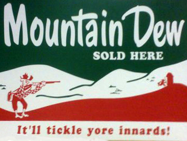
Going for the vintage/sign painter look. An homage to the early soda designs of Mountain Dew, Coca Cola, and Pepsi.


Here's a good resource for old soda design.

Monday, September 20, 2010

Cactus Cooler rebrand...

First rough, trying to capture the look of 80s/90s soda can design (which I grew up with). Also going with a simple composition: logo, sun, cacti.


I plan to take the next designs in a completely different direction (color, imagery, etc.)

Cactus Cooler rebrand...

In the light of a successful rebrand with Freight Baggage (still awaiting payment), which was originally inspired by the Plan B Branding's origin (minor league baseball team branding without solicitation) I have began consciously researching brand's that I love (like Freight Baggage) and redesign/rebranding them.

This time I have taken an interested in an under appreciated soda that I feel could use a redesign to capture the audience that they have unfortunately not attracted. Cactus Cooler. Described as an "Orange Pineapple Blast," Cactus Cooler began with a simple orange, green, and yellow color scheme, and a simple lowercase san serif logotype.


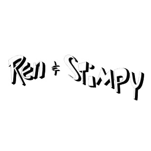
Recently (to my knowledge), Cactus Cooler has gone with a more illustrative backdrop and used a "Ren & Stimpy" typeface. Also, they have included a sunburst explaining the flavor in the center of the can.


I will keep you all posted as I work on their new look.

Followers