This time I have taken an interested in an under appreciated soda that I feel could use a redesign to capture the audience that they have unfortunately not attracted. Cactus Cooler. Described as an "Orange Pineapple Blast," Cactus Cooler began with a simple orange, green, and yellow color scheme, and a simple lowercase san serif logotype.

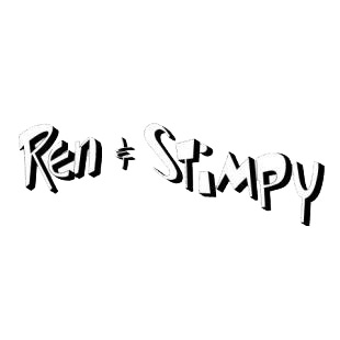
Recently (to my knowledge), Cactus Cooler has gone with a more illustrative backdrop and used a "Ren & Stimpy" typeface. Also, they have included a sunburst explaining the flavor in the center of the can.

I will keep you all posted as I work on their new look.

No comments:
Post a Comment