Monday, January 23, 2012

Clarisonic PR Day Event NYC

Here are some shots from the Clarisonic Acne Clarifying Collection PR event last week:

Reception

Guests leave the reception and proceeded to the "Fact or Fiction" wall, where Co-Founder of Clarionic Dr. Robb dispelled rumors about Acne. During his speech guests were given paddles with "Fact" and "Fiction" printed on either side - when prompted with the subject (chocolate, adolescence, etc.) guests showed whether they thought the statement was fact or fiction. Afterwards Dr. Robb would put a large "fact" or "fiction" sticker on the image.


Around the corner was the "Blemish Breakdown: An Acne Timeline" where Dr. Robb would lead guests through the various treatments of acne throughout history.


After the timeline wall is the "What People Are Saying" wall with quotes from across the country praising the new collection.

Finally, the tour ends at a presentation where speakers performed demos and informed guests of the benefits of the new product.

Sunday, November 13, 2011

Noah Cody

Got my best friends website up for his portfolio list:

Sunday, October 23, 2011

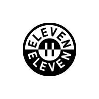
11 11 11

Icons for an event on Nov. 11th for work:


Tuesday, October 18, 2011

Amulets


Berepper Brewage

My friend Matt and his family have been brewing their own beer for a while now, and recently asked for my help with an identity and label design.

Here are the latest three:


and here are the earlier rounds:


Sunday, October 16, 2011

Houston Texans

Once the Oilers, now the Texans (a revival of the original Dallas Texans).
Below is the current logo:


The typeface is fine, but it echoes the oversimplification of the bull mark. I understand the nod to the Texas flag but it's still too plain and executed poorly.

If you want to use an animal why not use the whole body like the Lions, or the Bills?


I propose a stylized bull charging (full body) in gold with a blue stroke on a white helmet. Even my wife agrees, "there are too many blue and red teams"

The gold is to separate the team from the pack a little - keeping away from the strict blue and red teams we see so often (Bills, Patriots, Giants, Titans)


Saturday, October 15, 2011

San Francisco 49ers

San Francisco 49ers - amazing team with a rich history - forget about the Super Bowl blowout against the Chargers :(

In 1996 the 49ers changed their helmet decal to what you see here:


They added a tapered gold ellipse around the red oval and a solid drop shadow the the "SF." One thing that always bothered me about the logo is that the "S" is above the "F" and not interlocked. Why wouldn't it be? Is there anything gained by the gold stroke around the red oval? Seems superfluous. I can't help but reiterate that the old logos are what sells. Everyone is buying old merch, not new.


My logo proposes the interlocking of the "S" and the "F" and the removal of that gold stroke. As well as a return to the bright red instead of the maroon that the team has adopted lately.

Here is a look at the current logotype:


Below is my attempt at something new:


The old time, wild west type had to go, no question. So the logical solution would be a serif type - which they used in the updated logo, but I am proposing a cleaner look. Here I've used Baskerville Italic. The type is relevant to the period (1849) but not so dated that the type doesn't apply to contemporary design sensibilities. I also put more emphasis on the time period by making the type "gold" instead of red.

Black and white application:

I've also created a secondary icon of the 49er himself:


Here is a look at the helmet and uniform:


Followers